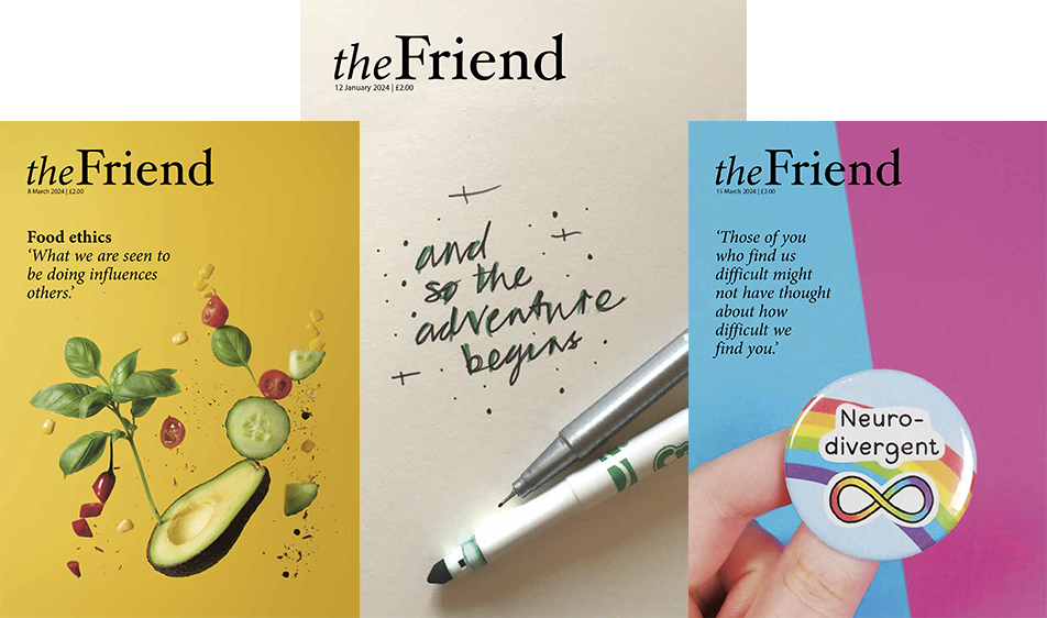
The front cover of the new format The Friends Quarterly Photo: Tony Stoller

FQ editor Tony Stoller describes the background to the new format for our sister magazine

A new look for the Friends Quarterly

FQ editor Tony Stoller describes the background to the new format for our sister magazine

by Tony Stoller 12th August 2011

The new issue of the Friends Quarterly looks very different. This is a redesign that will carry the periodical through the coming years, while seeking to stay true to a tradition that was begun 144 years ago. Every editor knows that you play around with the look of a publication at your peril. Many of the UK’s newspapers took the step away from broadsheet to tabloid many years ago, and as Marshall McLuhan foresaw that changed not only the layout but also the content, and the style with which it was presented. Smaller pages make for shorter sentences and shorter words within them, challenging the ability to follow complex trains of thought. The Friend skilfully took a step in the opposite direction, moving to a larger and more open format.
The Friends Quarterly was first published in 1867 (as The Friend’s Examiner). It has appeared in its Demi Octavo format for a long time, although the typeface moved to the Franklin Gothic Book font in 2006. Those nineteenth century sizes for publications were planned to take full advantage of the number of smaller pages which could be cut from larger sheets of paper. These days, however, paper sizes are determined by the international standard ISO216, based on a metric system. Moving to an A5 size for the Friends Quarterly from this summer onwards allows us to avoid wasting paper in printing. We are also following the Friend in having a slightly larger publication, to give plenty of space for the thoughts of Friends to expand.

The new typeface is Calluna Sans, a modern and we hope readable print with an excellent range of glyphs (the number of different forms that the typeface can take). Readers have made many suggestions over recent years about the best font for readability. The size of the printed type represents an unavoidable trade-off between ease of reading and the number of words we can print, while allowing enough white space on the pages to help those who are challenged in reading for one reason or another.

The layout has been designed by Anthony Viney, of Viney Associates. Unlike the Friend, we do not plan to have an illustration on the front cover, other than for exceptional issues. A serious quarterly periodical is necessarily very much about serious-minded writing, and in that we are blessed in our contributors. The new issue includes articles by Carole Hamby, Rowena Loverance, Roswitha Jarman, Anne Adams and David Cadman. By the end of 2011 as a whole, we expect that they will have been joined by David Ian Hamilton, Ben Pink Dandelion, Stephen Sayers, Robert Howell, Peggy Heeks, Alison Leonard, Marisa Johnson, Stephen Yeo, Jennifer Barraclough, Robert Daines, Felicity Kaal, Robert Breckenridge, Harvey Gillman, Paul Oestreicher and Richard Layard.

The Friends Quarterly sets out to offer articles by Quakers, and by those who have something to say to, and of interest to, Quakers. We welcome contributions from across the Religious Society and beyond. The Friends Quarterly does not seek to be impartial, although we try to offer diverse views and seek to cover an eclectic range of topics. However, this is avowedly a spiritual endeavour – only in that way can we aspire to be at the heart of Quakerism in Britain and beyond.

Articles for consideration for the Friends Quarterly should be sent in .doc or .docx format to tony@thefriend.org

To subscribe to The Friends Quarterly, please use the form in last week’s Friend or visit www.thefriend.org


Comments


Please login to add a comment